Visualising Translation in the Reformation
These visualisations are based on work undertaken by participants in the Introduction to Digital Humanities course run by the Taylor Institution Library.
Network Graph
This visualistion shows who was translating whom, when, and through which publisher.
The data comes from ESTC records, supplemented with information from wikidata.
Any record containing the word "translation" whether in the title or the notes, or any other field, was available for inclusion. Each participant worked on up to ten records. Therefore many records from the ESTC are not yet included in this visualisation. It will be added to each time the course is run. It may suggest avenues of research in its current form, but please don't base any conclusions on it!
This is a network graph. It is a directed graph, which assumes that publishers choose which translators to work with, and the translators choose which authors to translate. Publishers -> Translators -> Authors. Publishers are coloured green, translators are orange, while authors are blue. The connections (known as edges) are shaded by the date of publication of the work which is the basis of the relationship. Lighter colours are further back in time. Darker colours are later publications.
The visualisation was created using Gephi.
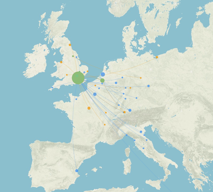
Geographical Visualisation
This visualisation shows the places of birth of authors (blue), and translators (orange), connected to the place of publication of their works (green). The size of the place markers is determined by the number of works. This gives an impression of the sources of the ideas that were being translated and published into English or in England (some of the translations are into Latin) during the Reformation. We would have like to show the place of active work of each person, rather than the place of birth, but unfortunately that information was not reliably available. As with the visualisation above, the data comes from the ESTC, supplemented with information from wikidata. The map was created using Palladio. As above, the data is a small sub-set of ESTC records, and should be viewed with caution.

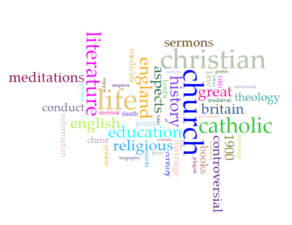
Word Cloud
This final visualisation was created from the subject headings of the works, as recorded in the ESTC. The subject headings use the Library of Congress rules. Terms that occur a lot, without conveying much meaning, such as "Early Works to 1800", have been removed from the visualisation.
The word cloud gives an impression of the subjects covered by the translated works in this period. It was created using Voyant Tools.
